sweet •••••••••••••••• (the story behind the shapes)
")

My first idea for the Sketch Book Project was to write an optimistic poem about transcendent love. In mid-fall 2017 I wrote the poem and then began making pencil sketches based on the images I was conjuring up from the words, but from the beginning of the drawing process it felt contrived. I couldn’t see myself inking in these floating, smiling, flying figures and letters. Nevertheless I retained some kind of delusion that I could follow through with my plan at a later date given that the deadline to turn it in was set for spring of 2018. As my wife and I were planning to be in Mexico for a month in the winter, I figured I could allocate time then.

So I decided to postpone my work on the sketchbook as I was preparing for the #dailypieces for 2018. I had already started to do experiments cutting pieces of wood with a laser cutter. In addition to the fairly straight forward pieces I was cutting for the project, I also made a stencil of my Love Is Possible design.

I became intrigued with the small shapes that resulted from the letters and forms of the design and had some fun arranging them into different compositions. This reminded me of some of my earlier ideas for the #dailypieces project. Usually when a new idea about my daily art projects emerge, the initial spark subdivides, each instance growing legs and scurrying about.
The initial idea for 2018 was to design a unique form for each day, cut beforehand, and then paint it on the assigned day. The idea was quickly dismissed because I like the immediacy of drawing curves to be representative of the individual day. But the idea of drawing many unique forms took hold in my mind. As a result I started drawing solid shapes with many odd angles inside my quad lined notebook where I usually start new ideas.

It was a departure from the drawings I was making for the #wormcultofinfinitebliss and #goodknightfish where lines and forms were more often than not connected to one another, and I kept thinking that I needed to start working with distinct forms. This new direction addressed that thought to satisfaction. Additionally, the shapes somewhat resembled the forms I had recently been painting on the #dailycards for 2017.

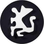
Drawing and filling in forms with black only, I was at first rather disappointed with the result. Undaunted, they improved in that I decided to fit the forms within the boundaries of a page. As the experience and the results improved, it struck me that this is what I wanted to do for The Sketchbook Project, giving the creation of these forms a purposeful challenge.
When I was working on the initial idea for The Sketchbook Project, I counted how many pages were in the book so I could pace the amount of words written for each page. Now this number took central precedence in my ideas for the book. Page 1 would contain 1 form, page 2 would contain two forms, and so on.
These ideas congealed in late December and due to my excitement I set about making the drawings immediately. However, because of travel and other project commitments, progress was slow. With this start/stop pace I discovered difficulties in keeping track of how many forms I had drawn on a page. While I was enjoying the challenge of not numbering the forms, I had to resort to doing so as my chief concern was to keep drawing the forms without sketching them with pencil beforehand, or having to use white paint in order to fix a mistake. Had I had to do the former I would have seriously considered scrapping the book and purchasing a new one.
Delightfully, three new projects emerged after I started on The Sketchbook that allowed me to flex this new direction in my work. The first was a mural for the beach house of my wife’s family in Brazil.

While the design contains more than two colors, and the forms do touch one another, the overall feeling owes much to the compositions in The Sketchbook.

The second project borrowed directly from The Sketchbook in both form and concept. The Jelly Bean Farm music label contacted me for a new EP release titled ‘Collab Cuts’, a series of seven tracks that were all collaborations between Squane, the co-founder of the label, and seven other artists. With a two day deadline, I immediately offered a sample of the compositions I was working with in The Sketchbook and we hashed out a concept where one form would represent Squane in the center of the piece with seven different forms surrounding it.
The process was so quick and intuitive it felt like I was traversing a stream of water with no bridge, and an angel was placing footholds as I made way across. The work was roughly completed half a day before the deadline.

The third and final of these was a gift/commission from the friends in Porto Alegre that we stay with every time we visit. In this instance I combined the number of forms to be drawn with the dice rolling aspect of the #dailypieces for 2018. This determined the number of forms as well as what color I would use. I made twelve pieces in total, with half of them dedicated to each person, who had rolled the dice for the colours, background and two foreground of each piece. After the rolls were done I thought that I should have had a coin toss for each form to determine if it should bleed off the page. Maybe for another future project.
With all these projects finished I resumed focus on The Sketchbook. As it neared completion I lamented a bit on the lack of narrative within the work, beyond the story that brought the work about. At this time my wife and I were in Rio de Janeiro and I noted how one of the forms on page eleven looked like a woman with an empty womb. A day or so later I showed the as of yet incomplete book to a friend who noticed a form that looked to her like a descending kitchen knife. Somehow these two images made me recall an ongoing fascination I have with the Habsburgs. I recall thinking of the coat of arms of the Holy Roman Emperor, leading some of the forms to look like eagles, but in my mind devolving into chickens. One of my favorite figures from the Habsburgs is Charles V. On his wikipedia page there is a detail taken from a painting where he is sixteen years old. All of these images lead me to want to title the The Sketchbook ‘sweet’ with the pages of the book and the counting of the forms filling in the hidden title ‘sweet sixteen’, the name of the number being encoded with symbols.

I imagined to myself that the progression of the pages could elude to a party for Charles V (if he were a 16 year old girl). I drew the word ‘SWEET’ on the cover, and also wrote a poem based on concept I had developed around the drawings. I debated if I should include the poem in the book, but decided against that as writing a poem in the first place was more of a method to drive the creation of the book, and now that a different and more enjoyable process had emerged I saw no point as the desired result was to make drawings as the end result. Sweet.
You must be logged in to post a comment.